Showing posts with label Nostalgia. Show all posts

Tuesday

A visual 90 second gem of a film


Once in a while there comes along a commercial that appears more like a movie clip, a trailer if you will, to bring its message to you. British Airways “To Fly - To Serve” is executed as if it were a major motion picture.


This is not an endorsement for British Airways, rather the desire to share a masterful and superbly crafted film, which embodies the companies heritage with the history of aviation. These elements were brought together through people, the aircraft, and CGI.


After watching the commercial, I know you will agree with me, that this is indeed a visual gem of nostalgia, which captures the romance of early flight, including the men who who not only pioneered aviation, but dared the unknown.


British Airways 2011 ‘To Fly. To Serve’ commercial

Transcript:
 
Those first young men, the pioneers, the aviators building super highways in an unknown sky. Leaving wives and children in their snug homes, with just a kiss and a promise to return.

Roaring into the clouds to battle wind and stars.

Their safety systems built of brain and heart. They landed where there were no lights. Transforming strange names from tall tales into pictures on postcards home. And those next young men, traveling further, faster, higher than any in history and the ones who followed them, who skimmed the edge of space, the edge of heaven, the edge of dreams.

And we follow them up there to live by an unbreakable promise. The same four words stitched into every uniform of every captain who takes their command.
To Fly. To Serve.


The making of the British Airways ‘To Fly. To Serve’ commercial


Making the most of visual effects


The background of the aircrafts in the film


I hope you have enjoyed it as much as I have.


Thank you for your visit
and comment . . .
Egmont


Saturday

An altered orchid


For the last two months I have been itching to paint, especially after my return visit to cardiovascular rehabilitation that lasted till mid-December. Knowing that I would not be abe to paint for a few more weeks, I just had to satisfy my creative urges and so decided to the camera and photograph one of our blooming orchids. 

Alice's Workshop

After uploading the images and working on a select few in Photoshop, I decided to explore other options to its appearance. That same day when visiting my friend Christiane’s blog Ninifees DosiNews from Germany, she had posted samples of her recent work of image alterations she was working with, because she is taking part in Alice’s ‘Magic Light’ Workshop


Considering I was working on the following altered images, I was intrigued and after looking in on Alice’s blog, I also decided to participate and share my process.


Though Alice choose the theme a 'Winter Landscape' or a 'Winter Theme' for the pictures, I have little choice, living in Northern California where snow fall at my altitude is rare. For any snow covered landscape I would need to travel where the mountains are, five hours away from home. So I apologize to the other participants in this workshop with my offering of an orchid growing in our garden and hope that it will bring the viewer not only pleasure but also a sign that spring is not far off for them too.


RAW image


After the unprocessed RAW file has been has pre-treated in Photoshop (PS) it is saved and reimported into PS and given a new name. The next two steps are adjustments in LEVELS and CURVES, followed by COLOUR adjustments and CONTRAST if necessary. Regarding this image, COLOUR and CONTRAST changes were not needed.


The two images I am working with to create a third


Though I like the image of the orchids by itself, I desired to manipulate it only moderately, enhancing the photography by adding a textural overlay. I tried several textures before settling on this one. The process of selecting a texture is not taken lightly, as it will make or cause failure in the photographs final appearance.


The layers


One of the things I do routinely is to converted a photo to a Black/White, this allows me to evaluate the contrast range of an image. The settings for the Black/White Layer: ‘Normal’, ‘Opacity’ 100%; Red: 75; Yellow: 75; Green: 00; Cyan: 00; Blue: 00; Magenta: 00.


After doing this, another layer was added, a duotone tint composed of C030/M060/Y100/K020 to give the over all photo a tinted appearance. Reviewing the results, I tried a few combinations and then settled keeping the duotone but unselect the Black/White. 


Now I begin to fine-tune the percentages for the duotone so that there would be the right visual balance between the tint and the texture, while also permitting the orchid to achieve its optimum appearance.


Final version


Black/White conversion


Though I prefer the colour version of the picture, I still wanted to see it as a Black/White, not only to study the values but to see if it could stand on its own as a Black/White.

— — —


Part Two — The ground work


Image with only LAYERS and CURVES adjusted


Having taken several photographs that day, a number of exposures were in HDR and the following is a composite of three separate images with a variation of 1.7 f-stops between them. The lens was set to f-22 with an ISO of 200. All images in this presentation have a 300 dpi when worked in PS, including the previous demonstration.


The RAW files were first individually treated in PS before importing them into Photomatix Pro for the final assemblage. Re-imported into PS where adjustment in 'LEVLES' and "Curves' was made before adding any texture or colour tint layer.


Though this image differs technically from the previous non-HDR photograph, the following PS treatments however remain identical, other then that there are a couple of extra layers to demonstrate that by letting ones imagination wonder and experiment, we can achieve a variety of different results.


It was important for me to keep the same texture file and duotone tint, only adjusting the levels and percentages of both files and blurring both of the texture files so that its detail would not cause a conflict with the orchid or be seen as the same texture file used in the previous example.


The first layer in the manipulation is the C030/M060/Y100/K020 duotone tint; the layer is set to ‘Luminosity’ and the ‘Opacity’ to 25%.


This is followed with an overlay of the texture then applying Gaussian Blur, with a setting of radius 10.0 pixels; the layer to ‘Multiple’ and ‘Opacity’ to 75%, giving the image a grim appearance.


Wanting a little more of a grunge look, I experimented with another layer of blurred texture by simple duplicating the layer. The layers settings for texture #2 was changed to ‘Overlay’, with an ‘Opacity’ at 60% after achieving a desired effect for this stage of the process. 


Though I liked the golden effect that countered nicely with the grunge in the previous example, my next step is once again to see the contrast range by adding a Black/White conversion layer, which turned down the colour tones but only partially since the layers was set to 50%, making the flowers appear more faded. Settings for the first Black/White are: Layer: ‘Normal’, ‘Opacity’ 50%; Red: 60; Yellow: 60; Green: 40; Cyan: 60; Blue: 20; Magenta: 80.


With the second Black/White conversion layer added for the purpose of seeing it as a Black/White, I decided to play around with the settings after seeing it set to ‘Screen’, when the image became lighter, appearing having naturally faded over time. Settings for this second Black/White are: Layer: ‘Screen’, ‘Opacity’ 100%; Red: 60; Yellow: 60; Green: 40; Cyan: 60; Blue: 20; Magenta: 80.


I decided to pursue the progress by studying the image as a Black/White, which meant I would need to add a third Black/White conversion layer. After duplicating the layer, it was set to ‘Normal’, ‘Opacity’ 100%, with all the colour settings the same as in the previous two Black/White layers.


Since I personally like having most of my Black/White photographs as a duotone, this means adding another colour layer. I simple duplicated the tint layer of 030/M060/Y100/K020, with a layer setting to “Multiple’and ‘Opacity’ at 35%.


It was now time to experiment with the various combinations of layers I had created and see what would be possible. This would mean simple unchecking the active box of a layer and see what sort of results would be achieved. Only after a desired look would I consider playing with the percentages.


Part Three — The final steps and fine tuning


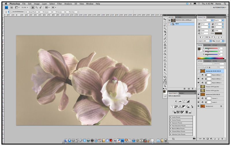
As you can see in the layer menu (bottom right hand of the image), we unchecked the top duotone layer, the Black/White conversion layer, and both textures. Now we are able to review the image as a faded photograph whose paper surface was not spoiled by dampness or age.


Adding back one of the second texture layer, I became really excited by the results that lay before me, however I cannot help but see what else is possible.


With the activation of the second duotone layer, I felt I finally achieved what I had set out to obtain. Now it was time to make myself a pot of green tea, clear my head by going for a walk in the garden until the tea had brewed.


Final version?


After I had a cup of tea, I under took one last serious critical observation of the image I had created, when after a few minutes I began to wonder if not all the tones were too muted and that the picture would need an airing, given a bit more life to it. By removing of the second layer of duotone, the photograph appeared was as if it had been cleaned by a conservator, retrieving some of the faded colours an removing decades of dirt.


The layers setting for the final version that follows


Final version


This truly was what I had pre-visualized, a picture post card whose age had been tempered by the decades of fluctuations in temperatures and moisture. A post card with softly faded colours that still had a story to tell.


What I hope you take away from this lesson, is that by keeping it simple and yet experimenting and trying various combinations of settings, we can achieve numerous versions from which to choose what pleases our senses and artistic interpretations. 


For me the final version reflects an image taken decades earlier, around the 1920’s and printed on post card stock for mailing. At that time the post card stock was mostly a warm buff colour, which over the years became darker and the single layer of duotone reflects this. Since time and moisture had altered the post card's paper, a single layer of texture was used to achieved this, while minimally changing the look of the orchid. The flowers faded colours keep us guessing as to if this was a colour photograph or a Black/White that had been hand colored, all of which only adding to the mystery of the image.


Before printing the file, another closer look is taken and any dust that was on the cameras image sensor, that now appears as little soft grey specks, is touched up and removed with the clone tool of PS.


Don’t you just love it when one's imagination just wonders freely?

— — —


* Please have a look at the other contributors in Alice's Workshop.


Thank you for your visit and comment,
Egmont


First day of spring


Winters solitude
comes to an end while a harsh
brittle cold lingers
in the morning when dew clings
to a blade of uncut grass


The once abundant
clusters of silver clouds now
transformed into an
abundance of grey shadows
dance to a gentle breeze and


meander through my
geological garden
of antiquity
There erupting into a
moment of euphoria


a wind chimes random
orchestration crescendos
then descends softly
into a harmonious
utter motionless stillness


On this capricious
day when the sun has reached the
vernal equinox
she will announce to us all
spring has finally arrived


Photo: Dutch Iris, my garden March 19, 2010


Tuesday

A Thanksgiving Day remembered


Over the years I have accumulated my share of enough memorable memories of Thanksgiving Day feast, but there are always a few that remain dear even for all the wrong reasons. The earliest I remember goes as far back as 1957 and I happened to be eight years of age.


The table was nicely set with a tablecloth and I recall there was a candleholder with four white slender candles that bathed the room in deep warm amber tones. There was a small ceiling lamp that filled in the darker empty areas and the only reason I remember this particular Thanksgiving Day was that I could not stop talking.


I was certainly a chatterbox that evening and even after repeated warnings to button it up, I just would not listen. When all of a sudden out of nowhere, my mother’s hand struck my left cheek, but her astonishment and mine, my father’s hand had struck my right cheek at the same time I felt the burning sting on the other side of my face.


There was a momentary silence as my parents looked at each other in a bewildered surprise, while I turned my head from one side to the other looking at each of them with my own shocked expression before all three of us busted out laughing.


Now I cannot recall if I did finally keep quiet and paid attention to dinner or continued talking, I can say that it was that the following month my father won in a raffle a huge unabridged Webster’s Dictionary, which was presented to me on Christmas Day.


Thank you for stopping by and I hope you are
surrounded with the sounds of laughter
and the fragrances of good food set
among family and friends on this
Thanksgiving Day.

Egmont


Thursday

A keeper of memories — part two


There are thirteen photographs in my possession out of a possible forty and all of a wedding. The only reason I know there are forty images is because the printer had numbered them by hand with a ball point pen on the back side, along with the studios contact information. These hand produced 4.5/8 x 3.5/8 inch prints have a sepia appearance because they were printed on sturdy Portralure Paper Y by Kodak and developed with Selectol. This would insure the prints having a warm brown to black tone appearance. However the paper itself also added to the allure of richness, with its pearl like reflective surface composed of a fine satin grain, softening any detail or imperfection.


The numbers that appear on the back of each print in no way can be associated with the sequence of the event the prints pictured. They appear randomized with no connection possible to a negative roll or the films exposure frame. One is left to speculate this to have been a smaller order for a guest or distant family member who was to receive only a selection of prints. However there are far more important mysteries to be unfolded, since none of the prints have any pertinent information other than who was hired to document the event.


The Bergé Studio, which was hired to cover the event, was located in Westlake, a district of Daly City, next to Lake Merced, where I grew up during 1960 to ‘63, just before we moved to the Eichler Highlands. Since photograph marked number three is of the church and there is a car parked in front, I am able to identify the vehicle as a Buick from anywhere in between 1959 to 1962. Regrettable though, the license plate is only a rectangle of solid colour due to the grain of the paper.


Apart from the visual evidence, the Bergé’s studio number was Plaza 5-0884, a system that was abandoned mid-1960’s in favor of an all numeric system. For those who cannot remember, the first two letters of a word referred to part of the number, in this case PL and one would dial PL5-0884 to reach Bergé Studio. Today 75 Fairway Drive is known as the Merchant Circle and the business at that location is GM Electric. According to property records, it last changed ownership on November 19, 1972 for $38.5000.


At least a narrow time frame has been established and now the focus is on the individuals in those photographs. Print number two marked seven, shows the bride and groom, now husband and wife, along with the three bridesmaid and their escorts. The bridesmaids are wearing matching gowns, veils, and gloves, while the men are in their black tuxedos, all have a carnation in the lapel, but not everyone is displaying a handkerchief in the jackets upper pocket.


With thirteen photographs, I hold only one-third of the puzzle. My first real question is about the collection itself and their previous owner. What was the person’s relationship to anyone pictured, for that matter, are they in any of these pictures? If so, who then?


I wish I had at some handwritten comments on the back of any of the photographs, at least a first name of the key characters, but even the lack of this kind of evidence reveals a clue. From the photograph taken during the vows I am able to estimate the number of guests being between forty-five and sixty, a moderate size depending upon your views. At first it would appear this to be an all ‘white’ wedding, but in one photograph were the guest are being greeted at the reception by the couple and the bridesmaid and their escorts, the face of an African American woman. It looks as though she came alone.


Studying the facial features of the two women next to each other, it appears with almost certainty that the maid of honour is also the daughter of the bride. This then raises further speculation as to the bride’s prior marriage. Had she been a widow or was her single status due to a divorce? If she was a widow, how did her husband die and when or how? The Korean War had started June 25, 1950 and lasted until July 1953, the daughter would have been between ten and thirteen years of age, if one estimates her age in the photographs to be about twenty-two.


I am leaning towards the bride having been a widow, based upon that there were 36,574 US military personnel killed in the Korean War and divorce was difficult up to the late sixties since California did not have a ‘no-fault’ policy. I also include into this synopsis that the mother would have mourned for one to two years, followed by about five years before actively dating again and only when her daughter had graduated from high school, possible in 1958. Adding two to three years on top of that for a courtship, I am right back at 1960-1961.


Obviously this is all highly speculative. Yet such information and more can be gleaned from such photographs and with a fertile imagination, can be woven into a tale, a short story or a perhaps, even a novel. Photographs have the power to entrap us with their silence. Especially photographs that are about to be lost forever because of a death, for they seem to cry out the loudest.


The Native American believed a photograph had the capability to steal a persons soul and that person would then doomed to roam endlessly the landscape, searching for peace. Possible they were right after all, as I continue to collect these old black & white photographs, not only for their intrinsic beauty or the mysteries they hold, but for those voices longing to be heard.


Postscript:

The next posting will be part three, the conclusion of Painting 101: Creating a distress background and will be available on the September 20. I am also announcing the development of my third blog, A Portrait in Time, to be launched beginning of the year. Further details will be shared in subsequent posts.


Friday

A favorite place of mine


At one point or another we all have a favorite place, it can be one that we have all to our own or a place we share with others. Since childhood I always had always a place I called mine, from the one under the staircase I claimed as a child, to the 120 square foot cottage that I had build in the backyard of our first house and which served as my graphic design studio. When we sold our home and I lost my cottage, we had moved into a larger house, one with a downstairs guest bedroom and its private bathroom became my new office space, the one the wife refers to as the dungeon because it is located at the lower level of our house.

Yet there is also place I feel in love with when I took a drive to discover what was there on the back roads where we now live. The location is less then two miles away and in these past eleven years I have watched closely the changing seasons upon this geographical location.

There is really nothing special about this section of land that is surrounded by rolling hills and where a two-way road cuts through its right side and runs along the base of several hills, a road that is traveled by those seeking a short cut to Martinez or Pleasant Hill.


Spring 2009

Earlier this year I drove by this magical field every Friday in order to attend my history of modern art class and depending on when I left the house, I would usually stop off, park the car, and take a number of photographs to record the weekly progress of the land reacting to the changing months and the weather.

In the previous years the field would be covered by the end of May in a sea of tall rich golden yellow muster flowers but this year, due to an unusual heat wave in January and February, along with a sever case of a drought, the plants rose to no more than two feet and never really matured into that ocean of yellow.


My Favorite Field in Spring
O/C, March 2002, 11 x 14 (27.94 x 35.56 cm)

Throughout the years I have painted this spot from various viewpoints. Either in early spring just as the ground broke open with the year’s new growth, to when the area was covered in full-grown muster flower, as well as when the plants were cut down and only dried bleach yellow stubbles remained.

Even when the land revealed its darker side after it had been plowed under; there was a beauty I found just as irresistible when the muster plants in all there flowering glory, stood tall.


My Favorite Field Turned to Gold by the Summers Sun
O/C, August 2008, 8 x 10 (20.32 x 25.40 cm)

However anytime I wish to cover another vantage point of this field I must locate an entrée area, since all the land along the road is sealed off with barbwire. When I do jump over a fence at a firebreak line, I need to keep my eyes open for any roaming cattle grazing, which includes possible snakes and depending upon the season, the blood sucking ticks.

Still I will return when ever the mood strikes and the light is right for more photographs from which I can draw upon for another painting, considering I can never stay long enough as I am trespassing on land owned by the water department and leased to the local cattlemen. It is rather a sad statement because I remove nothing from the land and I leave nothing behind, all I wish to do is enjoy its beauty and paint what I am experiencing so that others might enjoy what I have seen when they look at my paintings.


August 2009

As we near the end of summer and are closing in on late autumn, when the land will have been scorched brutally by the sun, I can only hope that with mid winter and the coming of spring, the clouds will return to darken the sky and unleash the angel’s tears upon the soil so that we can see once more the earth covered in an ocean of yellow.


Sunday

A keeper of memories

The last couple of days I have been feeling nostalgic, along with a good dosage of melancholy. Thought I should be excited for having come into the possession of a large number of Black & White including sepia-toned photographs dating from about 1890’s through the late 60’s, including a number of negative, several receipts from a trip to Europe, a letter from a father to his son in camp and plenty of ephemeral material; I cannot help but feel sad.


There are school portraits commemorating graduation of ones fourth or fifth year from an elementary school in the late forties and early fifties, Boy Scouts of America merit badges, even a driving citation for speeding in a school zone with a comment by the police officer that the ticket holder is to bring his parents to court.


As I look at all the items, carefully separating them into different stacks, I cannot help but begin to wonder about these people who’s ‘bits and pieces’ I now hold in my hand, asking why all this and more was it being discarded? Even though my ‘treasure throve’ came from a number of different sources, the thought of so many previous lives having been tossed into oblivion, to be forgotten, erased as if they never existed in the first place, pains me, despite receiving a reprieve from the garbage dump.


Some of the photographs clearly date back to the depression era and even earlier, while others show men in uniforms serving as a police officer or the armed forces during World War Two, there are pictures of a child riding his first tricycle and looking back at mom or the few other ones of grandma holding her first grandchild, while beaming with joy.


So what happened to all these people? Was the previous owner the last survivor of the family line? What causes these individuals, the keepers of these last memories to be themselves the lost souls whose death brings to an end a rich and complex life?


Like most other artists, I too am a collector, but when it comes to letters and photographs it is not about collecting, rather I see myself as gathering the memories of previous lives, a ‘keeper of a fragmented unknown history’ if you will, whose own survival is uncertain with each passing year.


Over the last several years the number of photographs have grown to over one hundred and eighty or more, and among these I do have my favorites, in particular those of a families spanning a couple of years or decades, revealing a glimpse into their daily activities, their relations with one another.


In their silence each photograph weaves a story that beckons to be told and whether you come across an entire album or a single photograph, do not look at it as a possession to be had, but rather to cherish the honour of being a keeper of memories.