For the last two months I have been itching to paint, especially after my return visit to cardiovascular rehabilitation that lasted till mid-December. Knowing that I would not be abe to paint for a few more weeks, I just had to satisfy my creative urges and so decided to the camera and photograph one of our blooming orchids.
 |
| Alice's Workshop |
After uploading the images and working on a select few in Photoshop, I decided to explore other options to its appearance. That same day when visiting my friend Christiane’s blog
Ninifees DosiNews from Germany, she had posted samples of her recent work of image alterations she was working with, because she is taking part in
Alice’s ‘Magic Light’ Workshop.
Considering I was working on the following altered images, I was intrigued and after looking in on Alice’s blog, I also decided to participate and share my process.
Though Alice choose the theme a 'Winter Landscape' or a 'Winter Theme' for the pictures, I have little choice, living in Northern California where snow fall at my altitude is rare. For any snow covered landscape I would need to travel where the mountains are, five hours away from home. So I apologize to the other participants in this workshop with my offering of an orchid growing in our garden and hope that it will bring the viewer not only pleasure but also a sign that spring is not far off for them too.
RAW image
After the unprocessed RAW file has been has pre-treated in Photoshop (PS) it is saved and reimported into PS and given a new name. The next two steps are adjustments in LEVELS and CURVES, followed by COLOUR adjustments and CONTRAST if necessary. Regarding this image, COLOUR and CONTRAST changes were not needed.
The two images I am working with to create a third
Though I like the image of the orchids by itself, I desired to manipulate it only moderately, enhancing the photography by adding a textural overlay. I tried several textures before settling on this one. The process of selecting a texture is not taken lightly, as it will make or cause failure in the photographs final appearance.
The layers
One of the things I do routinely is to converted a photo to a Black/White, this allows me to evaluate the contrast range of an image. The settings for the Black/White Layer: ‘Normal’, ‘Opacity’ 100%; Red: 75; Yellow: 75; Green: 00; Cyan: 00; Blue: 00; Magenta: 00.
After doing this, another layer was added, a duotone tint composed of C030/M060/Y100/K020 to give the over all photo a tinted appearance. Reviewing the results, I tried a few combinations and then settled keeping the duotone but unselect the Black/White.
Now I begin to fine-tune the percentages for the duotone so that there would be the right visual balance between the tint and the texture, while also permitting the orchid to achieve its optimum appearance.
Final version
Black/White conversion
Though I prefer the colour version of the picture, I still wanted to see it as a Black/White, not only to study the values but to see if it could stand on its own as a Black/White.
— — —
Part Two — The ground work
Image with only LAYERS and CURVES adjusted
Having taken several photographs that day, a number of exposures were in HDR and the following is a composite of three separate images with a variation of 1.7 f-stops between them. The lens was set to f-22 with an ISO of 200. All images in this presentation have a 300 dpi when worked in PS, including the previous demonstration.
The RAW files were first individually treated in PS before importing them into Photomatix Pro for the final assemblage. Re-imported into PS where adjustment in 'LEVLES' and "Curves' was made before adding any texture or colour tint layer.
Though this image differs technically from the previous non-HDR photograph, the following PS treatments however remain identical, other then that there are a couple of extra layers to demonstrate that by letting ones imagination wonder and experiment, we can achieve a variety of different results.
It was important for me to keep the same texture file and duotone tint, only adjusting the levels and percentages of both files and blurring both of the texture files so that its detail would not cause a conflict with the orchid or be seen as the same texture file used in the previous example.

The first layer in the manipulation is the C030/M060/Y100/K020 duotone tint; the layer is set to ‘Luminosity’ and the ‘Opacity’ to 25%.
This is followed with an overlay of the texture then applying Gaussian Blur, with a setting of radius 10.0 pixels; the layer to ‘Multiple’ and ‘Opacity’ to 75%, giving the image a grim appearance.
Wanting a little more of a grunge look, I experimented with another layer of blurred texture by simple duplicating the layer. The layers settings for texture #2 was changed to ‘Overlay’, with an ‘Opacity’ at 60% after achieving a desired effect for this stage of the process.
Though I liked the golden effect that countered nicely with the grunge in the previous example, my next step is once again to see the contrast range by adding a Black/White conversion layer, which turned down the colour tones but only partially since the layers was set to 50%, making the flowers appear more faded. Settings for the first Black/White are: Layer: ‘Normal’, ‘Opacity’ 50%; Red: 60; Yellow: 60; Green: 40; Cyan: 60; Blue: 20; Magenta: 80.
With the second Black/White conversion layer added for the purpose of seeing it as a Black/White, I decided to play around with the settings after seeing it set to ‘Screen’, when the image became lighter, appearing having naturally faded over time. Settings for this second Black/White are: Layer: ‘Screen’, ‘Opacity’ 100%; Red: 60; Yellow: 60; Green: 40; Cyan: 60; Blue: 20; Magenta: 80.
I decided to pursue the progress by studying the image as a Black/White, which meant I would need to add a third Black/White conversion layer. After duplicating the layer, it was set to ‘Normal’, ‘Opacity’ 100%, with all the colour settings the same as in the previous two Black/White layers.
Since I personally like having most of my Black/White photographs as a duotone, this means adding another colour layer. I simple duplicated the tint layer of 030/M060/Y100/K020, with a layer setting to “Multiple’and ‘Opacity’ at 35%.
It was now time to experiment with the various combinations of layers I had created and see what would be possible. This would mean simple unchecking the active box of a layer and see what sort of results would be achieved. Only after a desired look would I consider playing with the percentages.
Part Three — The final steps and fine tuning
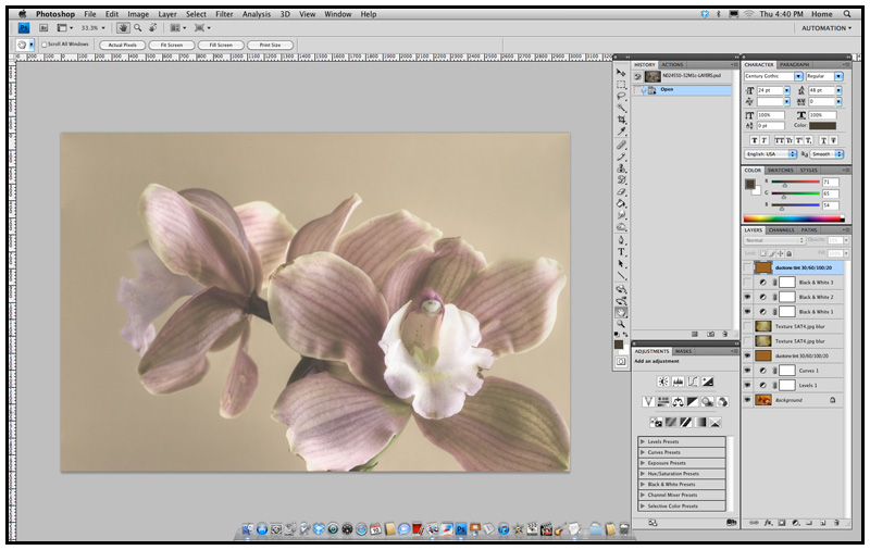
As you can see in the layer menu (bottom right hand of the image), we unchecked the top duotone layer, the Black/White conversion layer, and both textures. Now we are able to review the image as a faded photograph whose paper surface was not spoiled by dampness or age.
Adding back one of the second texture layer, I became really excited by the results that lay before me, however I cannot help but see what else is possible.
With the activation of the second duotone layer, I felt I finally achieved what I had set out to obtain. Now it was time to make myself a pot of green tea, clear my head by going for a walk in the garden until the tea had brewed.
Final version?
After I had a cup of tea, I under took one last serious critical observation of the image I had created, when after a few minutes I began to wonder if not all the tones were too muted and that the picture would need an airing, given a bit more life to it. By removing of the second layer of duotone, the photograph appeared was as if it had been cleaned by a conservator, retrieving some of the faded colours an removing decades of dirt.
The layers setting for the final version that follows
Final version
This truly was what I had pre-visualized, a picture post card whose age had been tempered by the decades of fluctuations in temperatures and moisture. A post card with softly faded colours that still had a story to tell.
What I hope you take away from this lesson, is that by keeping it simple and yet experimenting and trying various combinations of settings, we can achieve numerous versions from which to choose what pleases our senses and artistic interpretations.
For me the final version reflects an image taken decades earlier, around the 1920’s and printed on post card stock for mailing. At that time the post card stock was mostly a warm buff colour, which over the years became darker and the single layer of duotone reflects this. Since time and moisture had altered the post card's paper, a single layer of texture was used to achieved this, while minimally changing the look of the orchid. The flowers faded colours keep us guessing as to if this was a colour photograph or a Black/White that had been hand colored, all of which only adding to the mystery of the image.
Before printing the file, another closer look is taken and any dust that was on the cameras image sensor, that now appears as little soft grey specks, is touched up and removed with the clone tool of PS.
Don’t you just love it when one's imagination just wonders freely?
— — —
* Please have a look at the other contributors in
Alice's Workshop.
Thank you for your visit and comment,
Egmont






 Posts
Posts





