Showing posts with label Personal artistic style. Show all posts

Saturday

The beauty of a magnolia


The last ten days or so, I have been exploring further the potential of the iPhone 4S camera as an artistic tool, including the many different applications available at iTunes to manipulate and enhance those images.

Though there are obvious limitations, there are also many other advantages allowing for spontaneities without having to carry around a bulky load hanging from ones shoulder. So on a recent walk I came across a magnolia tree just begging to be examined more closely for that interesting flower.


Magnolia


With the desired end results achieved, there is the wish for some to know how the final image was achieved and as one can see from the collage, the original photo is rather drab in appearance. Though it is not a fair representation of iPhone’s capabilities, I should note that image was taken at dusk, hence the drab colors, which proved advantages in the end for achieving an old masters painting look.


Magnolia — before and after


In order to achieve the appearance of the final image, all post work but one were done within the iPhone, using Snapseed and ScratchCam, both available at iTunes. After saving several versions I wanted to blend the black/white old age emulated results with a more colorful version to attain a painterly quality of an old master, whose painting has been covered with decades of neglect.

Though there are applications available for merging two images within the iPhone, I elected to import both images into Photoshop for this final step, primarily because I wish to find a suitable program for the iPhone and not be rushed into it. In the meantime I continue looking for my next iPhoneography or Instagram photo.

This renewed vigor in photography has not only been a bust creatively but also kept the dark clouds from invading the mind, collapsing ones daily routine.

Those of you interested in iPhone photography and applications available, please visit ‘The iPhone Arts’ FaceBook ‘Page’ or to view my Instagram gallery.


Thank you for your visit
and comment . . .

Egmont


Monday

Elegance and Simplicity


In my last post I shared with you the development of a textured surface made created from paper that would be painted using acrylic and/or oils and now I would like to provide some samples of 5 x 5 inch study paintings in which you can see the results that can achieved.

All the paintings in this post, I used acrylic paints, except for one, were I used spray paint on a portion of the canvas. Some of the canvases had a portion of there surface area painted not with a brush, but applying a technique used by etchers preparing their plates for printing, by wiping off the ink, including using either a cloth or paper towel to remove some paint, only to use it also like a rubber stamp. This allows for the paint that was removed to be transferred back in a different area and by only covering the top surface, it leaves the crevasses untouched.


We can faintly see this method of transfer of off-white paint having been used on the larger area of the canvas to finish the painting. While a more dramatic effects are aimed for in the next sample by using brush and the etching method of cleaning ones plate.


The etcher’s method is when one uses either the edge of ones palm to wipe the surface of the copper plate and remove the excess ink. By using the side palm of ones hand, paper towel or a piece of soft cloths shaped in a ball and then carefully wiping the surface of the canvas and removing the wet acrylic paint so that it only portions remains in the crevasses of the papers textures. This can be clearly seen in the image above, were multiple colors remain scattered randomly about, building numerous layers of color amidst the texture.


The following painting uses a number of different combinations. First the right portion is sealed with painters tape so that I can brush the color yellow, followed by orange that is wiped off. However next I add a little orange acrylic directly to a ball of cloth and then with the same motion of removing paint from the surface, I am now striking the raised ridges of the paper texture and leaving behind concentrated amounts of random color.

Ones this portion of the painting is completely dried—I usually wait a full day—this area is taped off to protect the surface from the other area being worked.

Now instead of using brush or cloth subtract or transfer method, I employ spray paint, containing a fine texture to emulate a particular surface of stone. It was first given a light pass before a second one to firmly cover the area evenly with paint and texture.


Study for Elegance and Simplicity


Upon the completion of this study, I fell in love with the limited color selection and how the paper’s texture reacted to it that I would have to attempt a larger size painting. Doing so would also reveal how the idea on a much smaller canvas translates to a larger medium size one.


Elegance and Simplicity, close-up


On a technical note, the upper left area was first worked, meaning that the rest of the canvas was covered to protect the area. Instead of painting the exposed section, I applied some paint to the cloth and using the etcher’s method in reverse by applying the paint. However at the same time I also wiped the section clean. 

Using this technique, permitted me to color softy the paper, while at the same time leaving ample amount of paint against the raised ridges of the papers texture. This process was repeated several times until the desired visual effect was achieved.


Elegance and Simplicity, MM/C


After a few days the section just completed was covered and work on the opposite side began. One would think it were easier since it was black, but after three coats of acrylic paint, there was enough variation to balance the two sections.

The last area to be painted was the grey. This area too required several coats of paint before evenness and the loss of paint brush tracks disappeared. Several weeks later the painted was sealed with a matt varnish.

In the end, this painting was presented to my son for his twenty-third birthday.


Thank you for your visit
and comment . . .

Egmont


Saturday

I am finally painting again


Earlier this month we had record high temperatures as if it were mid-August, now it has been raining most of the week and by tomorrow the temperatures are to drop so low that if the rain continues, we are expecting the possible of snow in the lower elevations. The last time the Bay Area had any snow was in 1976, however I was in Europe at the time and therefore have no recollection of the event. 


Right now I welcome the rain as there is nothing better to do than to paint, continuing the work I started about a week ago on my first painting in more than a year ago. in the meantime I look forward to the possibility of a little snow.


After applying the sculptured material to the canvas, it was time to prepare the entire surface for painting by applying gesso. Doing so with a brush which which I will be painting in Acrylic and then using oils, helps me to contact mow directly with the surface and get a feel for the type of brush work I will need to apply for the desired effect.


It will be at least another two weeks before I may consider the painting finished, in part because white always takes longer to dry and the weather is not helping in that department. Besides, the process of painting needs to evolve, were the artist connects with the painting and vise versa. 


Upon the completion of the painting I will share with you the entire evolution and process, along with plenty of photographs that have documented the process through the various stages. So stay tuned.


Thank you for your visit and comment,
Egmont


Split decision


In the midst of our journey through the winter season, I begin my exit, leaving behind but not forgetting the last couple of months of contemplation and melancholy, when I begin to think about creating art. With the last coat of satin varnish having been applied, I am ready to share a painting, whose canvas surface first underwent distressing.


When I first wrote about applying newsprint to a canvas and then distressing the surface, I had yet to finish such a painting, even though I had proceeded to work on a smaller canvas with a drawing, then painting a winter squash. It remains unfinished because I still need to resolve a visual problem before proceeding.


Untitled
Unfinished, 12 x 12” (30.48 x 30.48 cm)


For a little more than two months the desire to paint has stirred deep within, however too many distractions cautioned me to curb those urges. However, a couple of weeks ago I was visiting my friend Ian’s blog Abstract Minimalism, it became even more difficult to resist those urges to paint. Ian had just posted Fired Earth, an acrylic multi-medium painting on newsprint. As I left a comment, I noted, “. . . where is the text of the newsprint?” When the comment was left on his blog, I was seeing his painting as if I had painted it and not Ian. I returned a few hours later and correcting my observations with a follow-up comment.


Fired Earth
Ian Foster, mixed medium, 24 x 24” (60.96 x 60.96 cm) 2010


If it were my painting, I would have revealed the newsprint and with that said, I could no longer curb those urges not to paint. On January 30, a canvas was pulled from storage, one already with five layers of gesso and sides covered with painter’s masking tape.


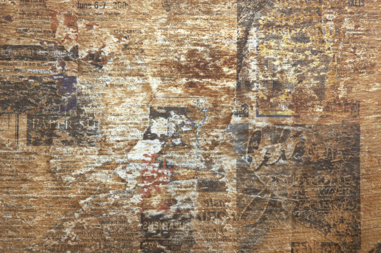
The canvas was covered with several layers of carefully selected pieces of newsprint, secured with medium gel and once completely dried, was sanded to achieve specific effects of distressing and blending of the images and type. This process was repeated an additional three times and between the layers, only portions of the surface was covered with new pieces of newsprint and then sanded, leaving selected sections untouched. Once the last layer was applied, the entire canvas surface was lightly sanded using a 150 grit sandpaper before being temporarily sealed with medium gel.


Close-up of the finished newsprint layer


During the process of applying the newsprint, several ideas were going through my mind; in the end it was important to keep it simple, minimalist but complex. This contradiction would be achieved by selecting only two colours, Burnt Umber and deep Cadmium Yellow, and then applied in multiple layers through glazing, thereby achieving a rich depth.


After two layers of glazing


Because the newsprint was sealed, it now needed to be lightly sanded in order for the paint to adhere. Using painter’s masking tape to seal off the area that was to later receive the deep Cadmium Yellow, the first layer of Burnt Umber was then applied. It was a mixed with glazing medium and a little bit of water and brushed on evenly, using a one and a half inch glazing brush. Because I was now using acrylic paints and not oils with Liquin, I was able to apply a second coat a few hours later that first day.


Close-up of the sanded area after the first two layers of glazing


The following day I tried something new, I began sanding a portion of the painted area, removing some of the Burnt Sienna and revealing more of the newsprint, rather then having the entire area evenly covered with paint. Doing so would allow sections of the finished painting to show more of the newsprint than in other areas of canvas. After adding coats four and five glaze, I repeated the lightly sanding the previous same area, while expanding into another section of the canvas for a little variety. With no further sanding to the Burnt Umber, another ten layers were applied over the next two days, allowing about two hours of drying time between each coating.


After four layers of glaze


Though I consider myself a methodical thinking painter, working out as many issues mentally in advance before starting to paint, I continued to analyze the process after each application of a glaze in order to adjust any technical aspects or even shift the initial direction the paintings outcome.


After the initial fourth application of glaze, I decided to adjust the mixture of the medium by omitting water from the combination. The water had caused the colour to dilute, something I did not want. I decided to use pouring medium, which kept the colours tone intact, but increased fluidness. This brought about a considerable shift in the colours depth and finally produced the results I had initially wanted.


After fourteen layers of glaze and a satin finish


Because of the heavy coat of satin varnish, I felt it best to let the painting dry for two days, since I would need to use painter’s tape to seal of portions of the area in order to obtain a perfect straight line where the two colours merged.


When I applied the mixture of deep Cadmium Yellow with the same approximate ratios of paint, glazing medium and pouring medium, the depth of the Cadmium Yellow seemed to evaporate. It was not until about seven coats that I was beginning to achieve some depth of colour. Adding more paint would only cause the translucency to become clouded, so I simply continued applying more layers after each one had dried for two hours.


After fifteen layers of cadmium yellow deep glaze


With fifteen layers of glaze, I decided that a little more drastic measures were needed in order to have a little more depth to the colour. The decision was that the final two coats of deep Cadmium Yellow would have the equivalent value of 6 layers each, meaning they were poured on as to be having the colour applied with a brush.


A larger quantity was mixed and poured onto the surface with little intervention of a brush, other than to help evenly spread the mixture. This had a more than pleasing appearance I had not anticipated, it produced a surface effect one sees on the hood of a brand new car. The depth, shine, and high gloss dominated the painting in contrast to the larger section with a satin finish and darker colour.
I never thought of having one section of a geometrical abstract painting be gloss and another part with a satin finish, but seeing the interaction between the two and the visual effect it generated, it is an idea I plan to include as part of the composition in a future painting.


Split decision
Acrylic on newsprint/canvas, 20 x24” (50.80 x 60.96 cm) February 8, 2010


—

As I bring this posting to a close, I regret to inform you that my on-line activities will be significantly be curtailed for the next unforeseeable future, because my Macintosh laptop has broken down. It has served with valor and distinction for many years.

Though it was repaired thirteen months ago, I cannot justify the expense of another repair or the purchase of a replacement, considering my jobless situation.

I hope that you my dear follower will understand when my visit to your site are not as frequent as I would like them to be.

Egmont


Friday

General Update


My not posting as often should not be considered that I am losing interest in either of my blogs or for lack of something to say. Rather I have been preoccupied as to the direction my art is taking me, along with another reevaluation of both my blogs.


Since blogging these past five months, I have come across numerous incredible creative artists and their amazing artwork. This has had a profound impact and influence as how I view my own solitary art but also the roll of my blogs and the purpose they are to serve.


When I started painting in 2000, I had two views; and two directions I wanted to go, traditional and abstract. After attending several college courses in 2008 and a contemporary art history class in the spring of 2009, my creative perspective was shaken up and since then, it has been in a continuous state of transition. During this evolutionary period, it appears I am languishing motionless, adrift without wind to move me ahead, when in fact this period is being spent reflecting inward about my current state and my art.


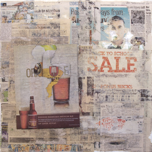
Progress on the distressed canvases has been slow. One, the largest of the set, 20 x 20” (50.80 x 50.80 cm) finally saw movement with the addition of two beer ads. When I originally came across the German beer ad from Spaten and the American Ale from Budweiser, I thought I would have some fun. The idea was to cover over the Spaten glass of beer and then rip off portion of the American Ale, revealing the Spaten underneath. Now that this has been accomplished, the collage can be considered finished, though deep down I feel one element is still needed to truly consider this painting finished and ready for my signature.


Untitled
Newsprint on canvas, 20 x 20” (50.80 x 50.80 cm)
Stage 4, layer eight


Untitled
Newsprint on canvas, 20 x 20” (50.80 x 50.80 cm)
Stage 5, layer nine


Close-up of the beer ads
Stage 5, layer eight and nine


On the other hand the smallest of the canvases, 12 x 12” (30.48 x 30.48 cm) has seen progress that is fraught with mixed emotions. I see the drawing being successful, I also see technical failure, and now I come to a crossroad, having to decide if I let it go or make the corrections.


Untitled — in progress, 12 x 12” (30.48 x 30.48 cm)
Stage 6, watercolour pencil over graphite pencil drawing


I view failure as success if one learns from the error. What I am referring to is the illustration of the acorn squash, which should have had a white under painting in order to cover the newsprint from showing through and influencing the illustration and its spectrum of colours. As I keep finding it a visual distraction and the fact that the colours appear not pure, I must now decide if I shall go ahead and carefully cover up the drawing and redo all the pencil and watercolour work.


On a more positive note, it was ten days or so I started two small canvases, both 8x8 inches (20.32 x 20.32 cm) and instead of going for a distressed background, I opted for a typographical composition. As for the next step or layer, well that to is like being the ancient mariner adrift on a still ocean with an albatross for company.


Untitled — in progress, 8 x 8” (20.32 x 20.32 cm)
Stage 1, 4-5 layers of newsprint


Untitled — in progress, 8 x 8” (20.32 x 20.32 cm)
Stage 1, 4-5 layers of newsprint


In less than one week it is time to celebrate the day that brings friends and families together, around a table decked with decorations and packed with wonderful dishes, while at its center is a roasted bird, a turkey.


There were well made plans in the works, that in a few days I would go on my last photographic expedition for the year and accompanying me would be Bruce and his son Kevin, both of whom I had not seen in almost a year. I would share with them my previous explorations by returning to two of my favorite finds, discoveries made after taking my daughter back to Santa Cruz, then traveling the long way back home along the Pacific coast on the Cabrillo Highway, Highway One. However the day we choose was simple too close to the American holiday Thanksgiving Day and after some contemplation, we decided to postpone the trip for another day.


Until my next post I wish you my dear reader and fellow follower all the very best,
Egmont


Saturday

Seeking a more personalized blog appearance


I am aware that I have not posted in these last twenty-one days or so and though like a number of new bloggers who make a good start only to fizzle out after a few weeks or months, I can assure that is not the case here. During my absence I have been busy visiting other blogs, studying their designs and layouts, occasionally commenting and exchanging correspondence, including posting a few days ago to The Artist Within Us, my other blog. On top of all this, there was a major distraction, as our daughter Ariana was now moving away from home to attend the University of Santa Cruz and though it is only 94.3 miles away, we are now experiencing the ‘empty nest syndrome’, even though our son Armont is still living at home, attending a college near by. Then last Tuesday we all celebrated his twenty-first birthday and all along it felt like we just brought him home from the hospital where he was born. In the meantime I have been reworking my two sites, developing a third, assisting my friend Ian and his blog Abstract Minimalism, which is about half way where we would like it to be. So you can see, there has been a lot of excitement around here and the dust that was stirred up, still has not settled.


You might have also notice the masthead has been changed from a water lily, to reflect the new season in which we find ourselves, with a photograph of a red Japanese maple growing in our front yard. Normally I like everything tack sharp and with no motion, but the breeze was blowing and my inner voice—to which I do not listen to enough—kept insisting I continue. Even the sidebar here and at my other blog has been revamped, not once but twice, with a few more adjustments due in the next couple of weeks, for a total of six redesigns since I started in April. This included just adding a number of photographs to break up the text flow. So where is all this going?


Apart from the author’s voice setting the tone of a blog, there is also the design of the site, which reflects a person’s personality. Take for example Lorraine Stobie, a mixed media collage artists, whose site Creative Daily was professionally designed by Trudi Sessons of Two Dresses Studio, who’s expertise in digital manipulation of multiple images and objects I have a great respect for. She not only took into account the visual aspects of a good blog design, like its flow, usage of colour and overall readability, but also Lorraine’s personality and the type of artwork she does.


This was achieved by including elements that are part of Lorraine’s life and were then arranged in a collage that enhanced the blogs visual appeal and placed off to the sides of the main page. However the full effect of the collages artwork only comes to shine when viewing Lorraine’s ‘biography’ page, which can be reach by a separate link that is located towards the top of the sidebar.


Even here the biography icon and other, like ‘Email Me’, ‘Inspiration’, ‘Archives’, and others, are all carefully designed with a repeating diamond pattern that is also used for Lorraine’s signature at the end of each post. In the end, the site sets itself apart from others, like a persons individual thumbprint, while retaining similarities to other crafting blogs.


In contrast to Lorraine’s bit of whimsy and special airiness is Layers, an artists whose work I greatly admire. Donna’s blog takes a different approach, by making use of the sidebar with photographs of her life, her surroundings and her interests, all of which is supported by her posts with images and the stories she tells. Her blog takes on a more Spartan approach, or if you will, a Wabi-Sabi sense of design, with a background colour that suggest one has entered into a blog with a Zen atmosphere; all of which reflects back to her style of artwork.


Though Donna’s artwork is comprised of richly layered metaphors, symbols, and a personal mythology, these appear at first glance in contrast to her Zen surroundings. This symbiosis of an oxymoron may have you scratching your head, but it is the very essence that comprises Donna’s spirit. Like most artists, she is a deeply complex individual with a ‘want and desire’ to absorb herself into her surroundings, emerging from it with new energies and ready to express her personal creative vision.


From these and other sites I have leaned a great deal and though I have thirty years experience as a graphic designer in collateral material and books, designing for the web or a blog is very different, even though there are a few similarities. So for now I continue making adjustments to my blogs, double-checking that both sidebars match in their placement of specific elements, while fine-tuning other aspects of the sites so that your visit will be a comfortable one.


Apart from having been preoccupied, I have managed to savor a few moments here and there, doing photography and exploring techniques I last used over thirty years ago, but now capturing images digitally with minimal application of software. My paintings on the other hand progress with their usual steady slowness, trying to overcome the fear of a wrong move and hoping for that touch of blindness in which inspiration takes over and the hand moves in charge of itself.


In the meantime I reflect upon a comment made to my previous posts at The Artist Within Us, about influences, an influence as far back as ones childhood and now having an effect upon the art one creates, Donna replied and in part said: “. . . the more personal your work becomes the more connection there is with others.


Postscript: Earlier in the day, under natural light, I had photographed a crane fly on a painters canvas drop cloth and by the evening decided to play around with it. After scanning envelops of letters from a previous relationship, some thirty years ago, I began extracting a number of these various elements and rearranging them on to the photograph of the crane fly.


Tipula abdominalis — Giant Crane Fly
Digital Multi-medium, October 9, 2009


Blogs mentioned in this post


Trudi Sessons — Two Dresses Studio
Lorraine Stobie — Creative Daily
Donna Watson — Layers
Ian Foster — Abstract Minimalism
My other blog — The Artist Within Us