Saturday

The making of “White on White”


A little over two weeks ago I pulled a canvas from storage and started my first painting in twenty-one months. My inspiration came from the Berkeley telephone poles I had been covering for more than five years in a series named “Typography Graveyard.”


The canvas was first covered with grocery shopping bag paper because of its strength, secured with medium gel, then a second layer of paper was applied. This application served to recreate the three-dimensional shapes that were captured in my photographs. Afterwards when the entire area was given another application of medium gel before everything was covered with gesso, including the underside of the exposed paper forms.


Now with the canvas surface prepared and ready for paint, the area was painted with three different shades of white acrylic paint, followed by one more application of acrylic colours so that I had the colourations I was after. A few days later it would receive a layer of oil paint, mixed with a high percentage of Winsor & Newton’s Liquin; this would function as a glaze and allow some of the acrylic painting to blend through, for a richer but still subtle colour range.


One of the features in this painting is how changing light within room affect the paintings surface. The many shadows that seem to come to life and chance the paintings appearance throughout the day. It is this added—not noticeable at first—nuance that turns a minimalistic painting into a contradiction of riches.


Stage one: covering the canvas with a layer of paper


Stage one: completed


Stage two, partial completion of the texture layer


Stage two: completed


Stage two: completed


Stage three: application of gesso


Stage three: me applying the gesso


Stage three: completed


Stage three: completed application of gesso


Stage four and five: completed application of two layers of acrylic paint.
What follows is stage six: a glazing with oil paints.


“White on White”
MM-O/C 36x48” (91.44 x 121.92 cm) 


Thank you for your visit
and comment . . .

Egmont


Sunday

Guest David Savellano and the ECAA


El Cerrito Art Association attending members

Last month I attend El Cerrito Art Association’s first meeting of the year, which featured guest speaker David Savellano, it was also my first exposure to the ECAA group. The large room was filled to capacity and a large number of the audience brought along their sketchbook and paints to follow along.


ECAA Director, Charlotte Britton 


David Savellano demonstrated travel sketching techniques and pointing out that one does not need much in materials, because what is more important is to capture the random moments in nature or anywhere else one chooses or the inspiration leads one.


David favors urban settings that requires adaptability and above all great speed. This means that one must focus on the essentials and know what to eliminate since everything at best is temporary. By focusing on the important elements of a scene, ones art work reflects the energy of spontaneity in this particular art form of expression.

  • Other points of David’s presentation focused on composition and keeping people and environmental objects in relative measurement

  • When drawing people to create an outline and then cross hatch in the shadow areas and nothing more

  • To gather photo and magazine clippings of people for reference when ones sketch is incomplete

  • Limiting ones materials to a small folding metal palette with professional quality tubes paints; a #8 round synthetic and medium size squirrel quill mop brush; and a Moleskine Watercolour Notebook 8x5” inch; a small bottle for water


David with a finished demonstration sketch


David Savellano lives in the Bay Area and is a native Californian, he has earned signature membership in the National Watercolor Society (NWS) and the California Watercolor Association (CWA).


During the brief break, ECAA members look over David’s watercolours and notebooks


I regards to my last post, the painting in progress, “White on White” has been completed and I will share with you the various stages of progress very soon. Not wanting to lose the momentum with which I seem to have started the year, this Saturday I pulled a canvas that has been patiently waiting around since 2008 to receive due attention and giving its first coat of paint.


Thank you for your visit and comment
Egmont


Saturday

I am finally painting again


Earlier this month we had record high temperatures as if it were mid-August, now it has been raining most of the week and by tomorrow the temperatures are to drop so low that if the rain continues, we are expecting the possible of snow in the lower elevations. The last time the Bay Area had any snow was in 1976, however I was in Europe at the time and therefore have no recollection of the event. 


Right now I welcome the rain as there is nothing better to do than to paint, continuing the work I started about a week ago on my first painting in more than a year ago. in the meantime I look forward to the possibility of a little snow.


After applying the sculptured material to the canvas, it was time to prepare the entire surface for painting by applying gesso. Doing so with a brush which which I will be painting in Acrylic and then using oils, helps me to contact mow directly with the surface and get a feel for the type of brush work I will need to apply for the desired effect.


It will be at least another two weeks before I may consider the painting finished, in part because white always takes longer to dry and the weather is not helping in that department. Besides, the process of painting needs to evolve, were the artist connects with the painting and vise versa. 


Upon the completion of the painting I will share with you the entire evolution and process, along with plenty of photographs that have documented the process through the various stages. So stay tuned.


Thank you for your visit and comment,
Egmont


An altered orchid


For the last two months I have been itching to paint, especially after my return visit to cardiovascular rehabilitation that lasted till mid-December. Knowing that I would not be abe to paint for a few more weeks, I just had to satisfy my creative urges and so decided to the camera and photograph one of our blooming orchids. 

Alice's Workshop

After uploading the images and working on a select few in Photoshop, I decided to explore other options to its appearance. That same day when visiting my friend Christiane’s blog Ninifees DosiNews from Germany, she had posted samples of her recent work of image alterations she was working with, because she is taking part in Alice’s ‘Magic Light’ Workshop


Considering I was working on the following altered images, I was intrigued and after looking in on Alice’s blog, I also decided to participate and share my process.


Though Alice choose the theme a 'Winter Landscape' or a 'Winter Theme' for the pictures, I have little choice, living in Northern California where snow fall at my altitude is rare. For any snow covered landscape I would need to travel where the mountains are, five hours away from home. So I apologize to the other participants in this workshop with my offering of an orchid growing in our garden and hope that it will bring the viewer not only pleasure but also a sign that spring is not far off for them too.


RAW image


After the unprocessed RAW file has been has pre-treated in Photoshop (PS) it is saved and reimported into PS and given a new name. The next two steps are adjustments in LEVELS and CURVES, followed by COLOUR adjustments and CONTRAST if necessary. Regarding this image, COLOUR and CONTRAST changes were not needed.


The two images I am working with to create a third


Though I like the image of the orchids by itself, I desired to manipulate it only moderately, enhancing the photography by adding a textural overlay. I tried several textures before settling on this one. The process of selecting a texture is not taken lightly, as it will make or cause failure in the photographs final appearance.


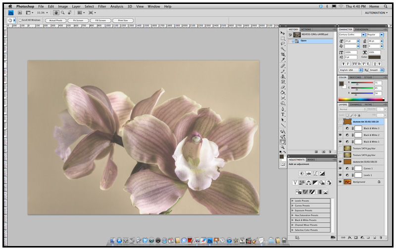
The layers


One of the things I do routinely is to converted a photo to a Black/White, this allows me to evaluate the contrast range of an image. The settings for the Black/White Layer: ‘Normal’, ‘Opacity’ 100%; Red: 75; Yellow: 75; Green: 00; Cyan: 00; Blue: 00; Magenta: 00.


After doing this, another layer was added, a duotone tint composed of C030/M060/Y100/K020 to give the over all photo a tinted appearance. Reviewing the results, I tried a few combinations and then settled keeping the duotone but unselect the Black/White. 


Now I begin to fine-tune the percentages for the duotone so that there would be the right visual balance between the tint and the texture, while also permitting the orchid to achieve its optimum appearance.


Final version


Black/White conversion


Though I prefer the colour version of the picture, I still wanted to see it as a Black/White, not only to study the values but to see if it could stand on its own as a Black/White.

— — —


Part Two — The ground work


Image with only LAYERS and CURVES adjusted


Having taken several photographs that day, a number of exposures were in HDR and the following is a composite of three separate images with a variation of 1.7 f-stops between them. The lens was set to f-22 with an ISO of 200. All images in this presentation have a 300 dpi when worked in PS, including the previous demonstration.


The RAW files were first individually treated in PS before importing them into Photomatix Pro for the final assemblage. Re-imported into PS where adjustment in 'LEVLES' and "Curves' was made before adding any texture or colour tint layer.


Though this image differs technically from the previous non-HDR photograph, the following PS treatments however remain identical, other then that there are a couple of extra layers to demonstrate that by letting ones imagination wonder and experiment, we can achieve a variety of different results.


It was important for me to keep the same texture file and duotone tint, only adjusting the levels and percentages of both files and blurring both of the texture files so that its detail would not cause a conflict with the orchid or be seen as the same texture file used in the previous example.


The first layer in the manipulation is the C030/M060/Y100/K020 duotone tint; the layer is set to ‘Luminosity’ and the ‘Opacity’ to 25%.


This is followed with an overlay of the texture then applying Gaussian Blur, with a setting of radius 10.0 pixels; the layer to ‘Multiple’ and ‘Opacity’ to 75%, giving the image a grim appearance.


Wanting a little more of a grunge look, I experimented with another layer of blurred texture by simple duplicating the layer. The layers settings for texture #2 was changed to ‘Overlay’, with an ‘Opacity’ at 60% after achieving a desired effect for this stage of the process. 


Though I liked the golden effect that countered nicely with the grunge in the previous example, my next step is once again to see the contrast range by adding a Black/White conversion layer, which turned down the colour tones but only partially since the layers was set to 50%, making the flowers appear more faded. Settings for the first Black/White are: Layer: ‘Normal’, ‘Opacity’ 50%; Red: 60; Yellow: 60; Green: 40; Cyan: 60; Blue: 20; Magenta: 80.


With the second Black/White conversion layer added for the purpose of seeing it as a Black/White, I decided to play around with the settings after seeing it set to ‘Screen’, when the image became lighter, appearing having naturally faded over time. Settings for this second Black/White are: Layer: ‘Screen’, ‘Opacity’ 100%; Red: 60; Yellow: 60; Green: 40; Cyan: 60; Blue: 20; Magenta: 80.


I decided to pursue the progress by studying the image as a Black/White, which meant I would need to add a third Black/White conversion layer. After duplicating the layer, it was set to ‘Normal’, ‘Opacity’ 100%, with all the colour settings the same as in the previous two Black/White layers.


Since I personally like having most of my Black/White photographs as a duotone, this means adding another colour layer. I simple duplicated the tint layer of 030/M060/Y100/K020, with a layer setting to “Multiple’and ‘Opacity’ at 35%.


It was now time to experiment with the various combinations of layers I had created and see what would be possible. This would mean simple unchecking the active box of a layer and see what sort of results would be achieved. Only after a desired look would I consider playing with the percentages.


Part Three — The final steps and fine tuning


As you can see in the layer menu (bottom right hand of the image), we unchecked the top duotone layer, the Black/White conversion layer, and both textures. Now we are able to review the image as a faded photograph whose paper surface was not spoiled by dampness or age.


Adding back one of the second texture layer, I became really excited by the results that lay before me, however I cannot help but see what else is possible.


With the activation of the second duotone layer, I felt I finally achieved what I had set out to obtain. Now it was time to make myself a pot of green tea, clear my head by going for a walk in the garden until the tea had brewed.


Final version?


After I had a cup of tea, I under took one last serious critical observation of the image I had created, when after a few minutes I began to wonder if not all the tones were too muted and that the picture would need an airing, given a bit more life to it. By removing of the second layer of duotone, the photograph appeared was as if it had been cleaned by a conservator, retrieving some of the faded colours an removing decades of dirt.


The layers setting for the final version that follows


Final version


This truly was what I had pre-visualized, a picture post card whose age had been tempered by the decades of fluctuations in temperatures and moisture. A post card with softly faded colours that still had a story to tell.


What I hope you take away from this lesson, is that by keeping it simple and yet experimenting and trying various combinations of settings, we can achieve numerous versions from which to choose what pleases our senses and artistic interpretations. 


For me the final version reflects an image taken decades earlier, around the 1920’s and printed on post card stock for mailing. At that time the post card stock was mostly a warm buff colour, which over the years became darker and the single layer of duotone reflects this. Since time and moisture had altered the post card's paper, a single layer of texture was used to achieved this, while minimally changing the look of the orchid. The flowers faded colours keep us guessing as to if this was a colour photograph or a Black/White that had been hand colored, all of which only adding to the mystery of the image.


Before printing the file, another closer look is taken and any dust that was on the cameras image sensor, that now appears as little soft grey specks, is touched up and removed with the clone tool of PS.


Don’t you just love it when one's imagination just wonders freely?

— — —


* Please have a look at the other contributors in Alice's Workshop.


Thank you for your visit and comment,
Egmont


My first heart walk


This last Thursday I participated in my first American Heart Association Walk for 2010, joining the staff of Alta Bates Cardiovascular Rehabilitation Center and patients.


Alta Bates Cardiovascular Rehabilitation group


The weather could not have been any better, considering Friday was overcast and there is a forecast for light showers today. We were a small group of 23 individuals when considering Kaiser Permanente, Wells Fargo volunteers and other groups who participated in the annual event.


We meet at the clinic where Susan made sure we all had our Alta Bates T-shirts and red caps from the American Heart Association. Alta Bates Hospital provided two shuttle buses to take us to Lake Merritt in Oakland, where the festivities where being held.


Our group was divided into two, those who could manage the entire distance, while the other group did the one-mile route. As you see by the images, I choose the distance.


Alta Bates Cardiovascular Rehabilitation group


Lake Merritt is a focal point, as it stands out as a jewel of Oakland, with its unique combination of fresh and salt-water, it is the larges such lake in an urban area; consisting of 3.4 miles around the circumference of the lake and covering 155 acres of land.


The Cathedral of Christ the Light


We passed a variety of interesting architecture along our journey, including numerous wildlife from egret, herons and Canadian geese. It was at the half way mark I was beginning to wonder if I had made the right decision concerning my shoes, as I had opted for lighter weight then the heavier exercising ones, due to the distance, but all I could do was continue on with determination and so I did.


Once back where we all had started, Subway provided us with the selection of either a turkey or vegetarian sandwich, which came with a banana and a package of peanuts.
By the time I came home, I was indeed exhausted and my feel had paid their price, and yet if I were asked to sign up for the 2011 walk, I would do so without hesitation.


Though now I am home from cardiovascular rehabilitation last four weeks, I have begun to pick up the many loose ends that have been neglected since May. Though I long to paint and draw, it must wait but it also means I have not been busy enlarging my collection of photographic images of the Berkeley Telephone poles. A number of these I shall share in a couple of weeks.


I thank you for your visit
and comment . . .

Egmont


As one chapter closes, another one opens


Last Tuesday I gave a presentation on blogging to the East Bay Artists Guild. It was in regards to how artists and photographers can utilize this method of marketing over just having a website with static pages. Especially now that blogs in general are undergoing a transformation from just being journals to being a blend of website pages and journals.


The presentation was to be only ninety minutes, but with a wonderful and engaging audience it ended up being three hours, even then I could have continued for much longer and as you can see by the photographs, I was enjoying myself.


August 17, Pleasant Hill Community Center


On another bright note is that the last four months of cardiac rehab has come to an end, as I attended my last class, yet I am still not out of the woods. Though I have my 20-24 hours per week back, there is plenty to catch up around the house, while also maintaining an aerobics program so not to lose what I have gained. In the meantime we are also in the process to see if the insurance will pay for another four weeks of cardiac rehab but that may take a while. Never the less, for the next couple of months I plan to set aside time for visiting blogs and commenting, maybe even writing a post now and then.